01
Observe the mission
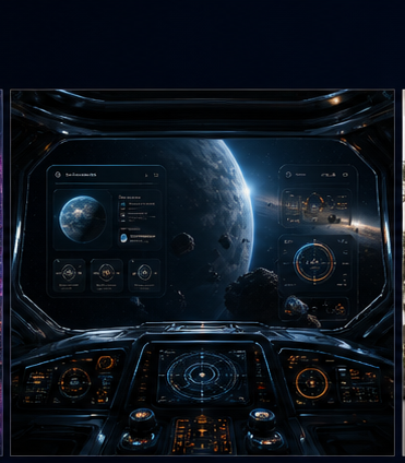
The page opens like a command deck, giving the client an instant read on systems, interface speed, signal volume, and project orbit.
Central Command
Systems
98.7%
Interface
42ms
Signal
7.4TB
Orbit
12nodes
Client demo story
This world is a demo for clients who need dashboards, operational tools, AI monitoring, analytics surfaces, or any experience where dense information must still feel exciting. The story is simple: chaos enters as raw signal, the interface organizes it, and the user leaves with command-level clarity.
01
The page opens like a command deck, giving the client an instant read on systems, interface speed, signal volume, and project orbit.
02
The central map turns skills into active nodes, making design systems, frontend craft, and storytelling feel connected.
03
The final panels translate the futuristic mood back into practical proof: dashboards, charts, responsive UI, and complex information design.
Proof for client
Shows the ability to make dense dashboards feel cinematic and readable.
Demonstrates chart composition, HUD hierarchy, system health states, and live-product tone.
Can be adapted for SaaS analytics, operations command centers, AI monitoring, fintech, or space-themed launches.
Add real D3 charts, live filters, command palette search, responsive data tables, and a case-study drilldown for each project node.
Art direction
The generated visual layer gives this route a real environment: mission glass, cockpit depth, glowing instruments, and a sense that data is being actively interpreted.
Human psychology
Dense interfaces become trustworthy when they provide orientation first. The cockpit metaphor tells the visitor where to look, what is active, and why the information matters.